
Go to the editor
Using the panel editor you can create your own creations tailored to your favorite game. In addition, you can share it with the community and offer the sale of your designs in exchange for a monetary reward in the store for each sale made.
To start editing a panel, although it is not necessary to be registered to start designing it, it is necessary to save it within your designs.
The editor panel is made up of several sections determined by:
-Naming Bar: Top bar to edit the name and other advanced options of the panel
-Components Bar: Left menu that offers all the components that you can add to your panel
-Panel Bar: Central panel where you can position all your components and elements, as well as adding a background design to the entire panel and its size
-Propierties Bar: Right menu where you can further customize each of the elements
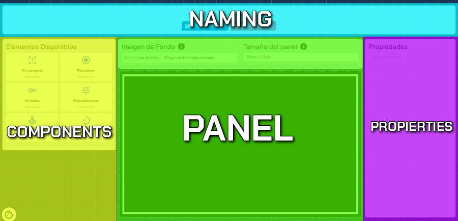
Naming Bar
In this section you can change the name of the panel. Once you've saved it to your designs (you must be logged in to save), you can also change certain advanced options from here, such as:
- Panel Description: This will appear on the panel's sales page.
- Make Public: This will appear in the general list of panels on the website.
- Allow Versions: If you decide that other users can use your design inspiration, you can preload it directly into their editor.
Components Bar
From here, you can search for the perfect component for your panel. From buttons, switches, sliders, joysticks...
Simply select the corresponding category and click on the desired element to add it directly to the panel to finish configuring and positioning it.
There are also some static elements (such as Text) that offer customization at the design level rather than a functional one.
Panel Bar
The heart of the editor.
In this section, clicking on one of the components you add will allow you to move them to position them in the location that best suits your play style.
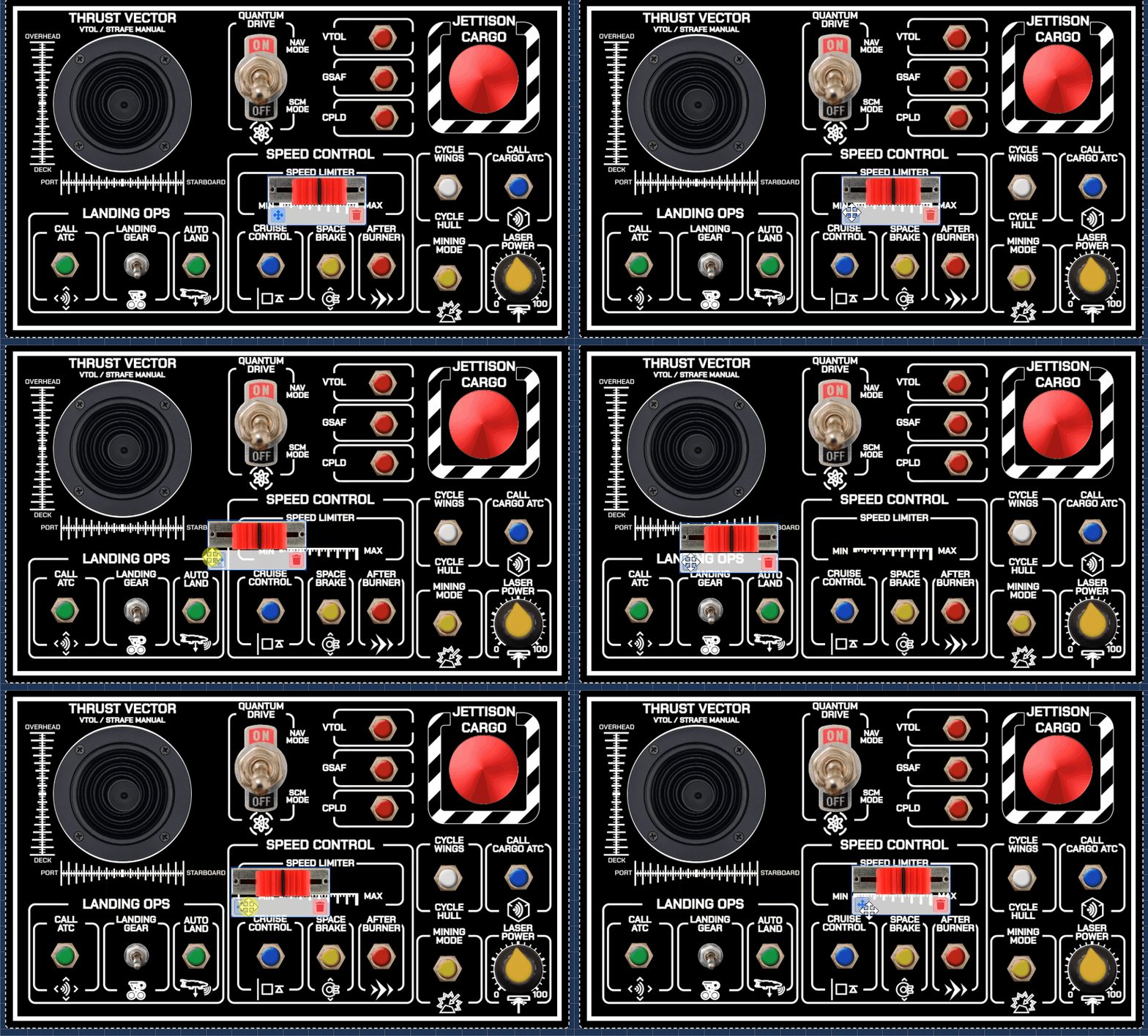
Likewise, with the component selected, you can delete it or edit certain properties in the "Properties Bar."
You can also add a "Background Image," which will allow you to create it as a template directly to be printed on your custom panel, giving your creation a unique touch.
Finally, you can choose between different panel sizes to keep your creation at the ideal dimensions for you.
Background Image Considerations
- The maximum file size is 2MB.
- The recommended format is a blank PNG or SVG.
- The background image will be displayed in the flight panel. It must be a size with the same proportions as the selected panel.
- Uploading an image with colors other than black and white does not guarantee its printing in any case.
Propierties Bar
In this section, you will be able to make some adjustments to the selected component associated with the design, in order to maintain printed labels that make it easy for you to recognize the component's purpose.
This way, you will be able to tell if you left a button to use "Turbo" or "Launch Missiles" :)
